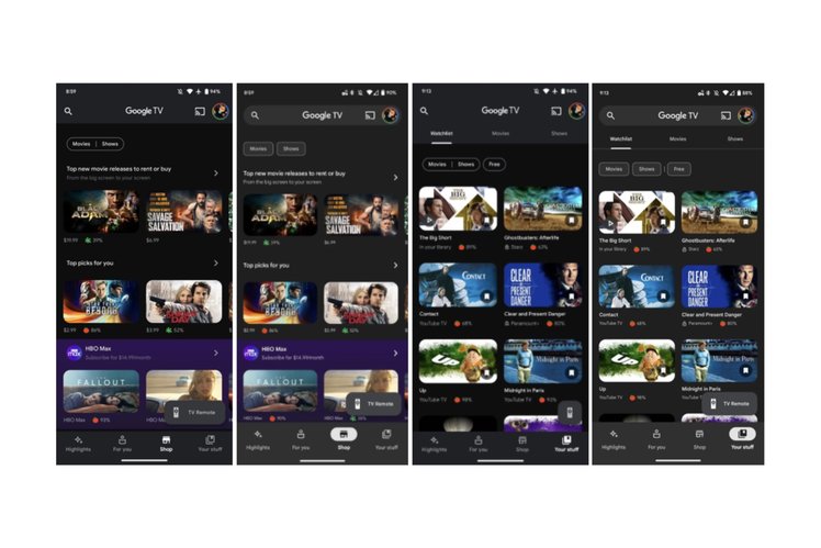
The Google TV app on Android has a new look, with a Material You refresh rolling out to users of the app on Google’s own platform.
The new look means that there are a few changes to the Google TV app including a large search bar that now sits at the top of the screen. That replaces the small search button that could be tapped in the old version of Google TV, with the search bar also housing the casting and account switching buttons, too.
At the bottom of the screen Google has also tweaked the tabs, adding a pill-shaped design to all four when they are selected. The previous design saw the active tab gain a slightly brighter colour, but it’s now much easier to see which tab you are in at any given moment.
A more subtle change is a new, lighter colour background that is less black and more like a dark grey, creating a look that has more depth somehow. It’s definitely more visually appealing and makes it easier to differentiate items from the background of the app itself.
It doesn’t look like everyone has access to the updated app just yet, though. It appears that the change is still rolling out and is server-side rather than app-based, so you might have to just wait a little while for it to hit your devices.

